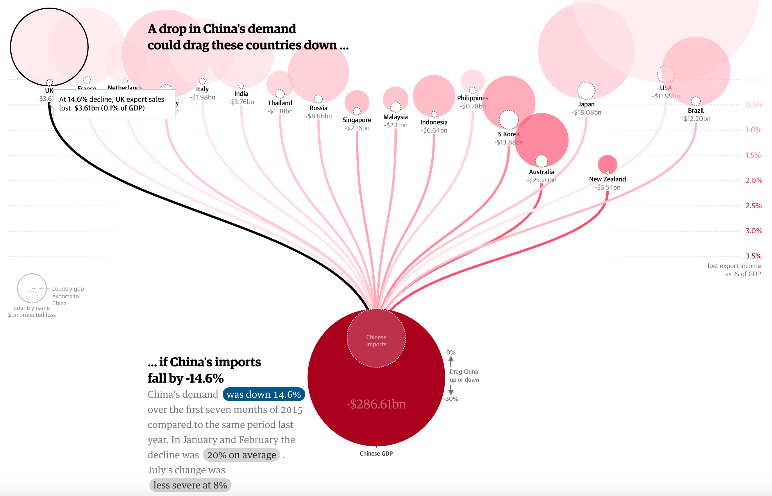
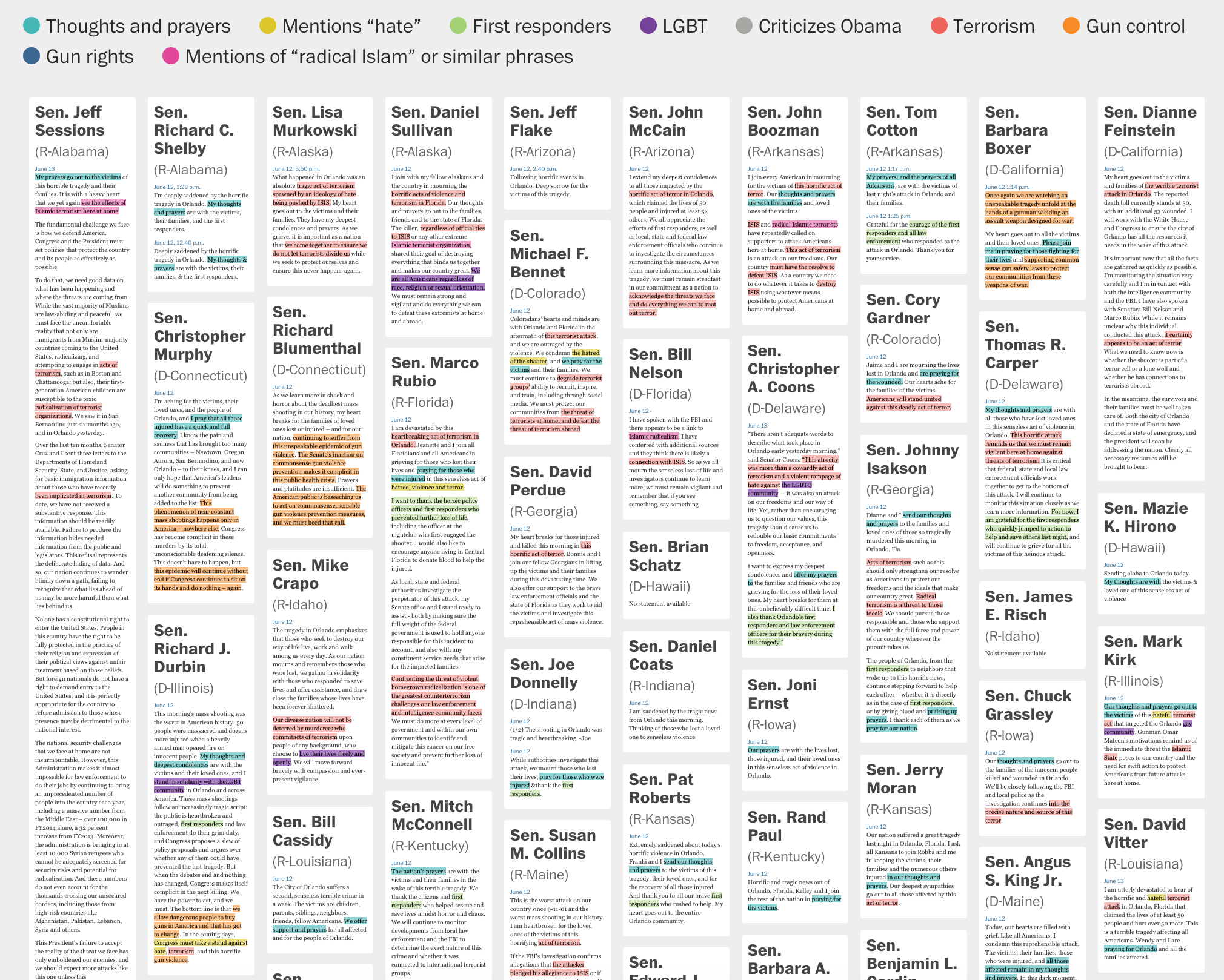
How do we connect humans and data about humans? In a world of abundant data about events, about changes in our social and physical environment, making sense of the noise, annotating the chaos is a fundamental journalistic task. Data-driven visual storytelling is a powerful way to affect people’s perception of the world. Paraphrasing a master: visualization gives us insight into data that wouldn’t be learned any other way.
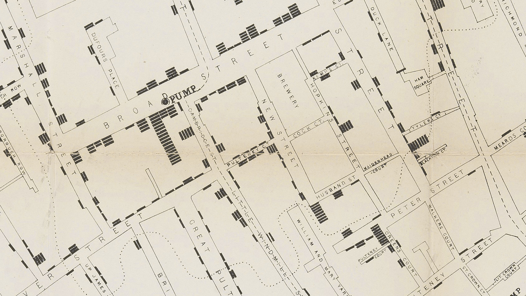
Data visualization and information graphics are far from being new concepts. But in the last 25 years, their importance as devices to communicate the news has risen. First as a way of making newspapers more striking and later as journalistic pieces of their own right, they are now an essential part of the journalist’s toolkit. From the early examples of Playfair, Dupin, Snow, Nightingale, or Minard to today’s interactive graphics from The New York Times, The Washington Post, Wall Street Journal, National Geographic or The Guardian, ‘good’ dataviz creates an emotional connection between data and the user of the visual device. It’s a powerful and memorable fact-checking and fact-delivering devices. Putting the data in terms that are relevant to whoever is on the other side guarantees that the public’s decisions are based on facts, reason and truth.